
PROJECT OVERVIEW
The product
Flood app is a tool to help people during the heavy rain season in Campinas-SP (Brazil). It is known that at that season, there are several accidents and losses of different intensities in the region. Flood app has a system self-powered by users, generating important information about risk areas, as well as creating alerts, weather forecast and supportive community. The app's target audience is mainly people whose routine involves leaving home frequently - whether to carry out professional or personal activities.
Project duration
November 2022 to January 2023


The problem
December rains in Campinas were 56% above the historical average in the city. The most common news at that season are: floods, fallen trees, accidents, damage of various kinds - such as infiltrations and landslides. A gap was identified in this area, with no specific and effective tool to help the community at this time, which causes so much damage - and which gets worse every year.
The goal
Design an app that will help and improve people's routine during the rainy season in Campinas.
My role
UX designer leading the app and responsive website design from conception to delivery.
Responsibilities
Conducting interviews, paper and digital wireframing, low and high-fidelity prototyping, conducting usability studies, accounting for accessibility, iterating on designs, determining information architecture and responsive design.
User research: summary
I used news data to amplify knowledge about the impact of the rainy season on the city and to better develop interview questions with users. Most of the participants in the interviews reported that the rainy season has a very intense negative impact on their routines and, as it is a long period (+- 3 months), it generates numerous losses - some minor, others major. Most users feel that the tools available today for tracking risk information are for cars and not for ordinary citizens - who often depend on public transport. The feedback received through the survey made it very clear that users would be open and willing to work to improve the community's routine during the rainy season if they had access to an easy-to-use tool.

Persona 1: Florence

User Journey
Persona 2: Albert


User Journey

Competitive audit
An audit of a few competitor's products provided direction on gaps and opportunities to address with the Flood app.


Ideation
I did a quick ideation exercise to come up with ideas for how to address gaps identified in the competitive audit. My focus was on risk reporting, community solidarity and weather forecasting.


Digital wireframes
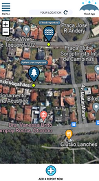
After ideating and drafting some paper wireframes, I created the initial designs for the Flood app. These designs focused on reportage of risk areas and visualization of the initial screen - which already presents the map with the user's location, as well as existing alerts.
.png)
Easy viewing of reports from risk areas in the user's current region
Extra option to add report in a faster and easier way - in addition to the option present in the menu


Low-fidelity prototype
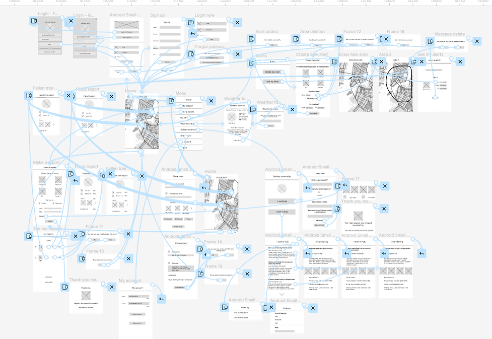
To prepare for usability testing, I created a low-fidelity prototype that connected the user flow of the main features of the app.
Usability study: parameters
Study type:
Unmoderated usability study
Participants:
5 participants
Location:
Brazil, remote
Length:
20 - 40 minutes
Usability study: findings
These were the main findings uncovered by the usability study:
1
Helpless
People feel helpless and would like help to face the rainy season
2
Home screen
People had confusion in this main screen, not knowing specifically where to go
3
Menu button
People didn’t find the menu easily, not being intuitive
Affinity diagram

Mockups
The login screen has become simpler and with less divisions, as some users in the usability test had confusion in this area.


Aftter usability study
Before usability study

Mockups
The app's main screen has been improved by placing subtitles in the menu, adding a report and also informing the user that the map on which it appears on the screen is its current location.
.png)
Before usability study

Aftter usability study
Mockups


High-fidelity prototype
The high-fidelity prototype followed the same user flow as the low-fidelity prototype, including design changes made after the usability study.

Accessibility considerations
Clear labels for interactive elements that can be read by screen readers.
Initial focus of the home screen on personalized recommendations help define the primary task or action for the user.
Sitemap
With the app designs completed, I started work on designing the responsive website. I used the Flood App sitemap to guide the organizational structure of each screen's design to ensure a cohesive and consistent experience across devices.

Responsive designs
The designs for screen size variation included mobile, tablet and desktop. I optimized the designs to fit specific user needs of each devide and screen size.


.png)
Next steps
1
Conduct research on how successful the app is in reaching the goal to help people in rainy season.
2
Study the hypothesis of encouraging people to make a rain gauge at home and register the data in the system for better monitoring of rain and risks.
3
Promote community solidarity with the aid tool for people who suffered material losses during the rainy season.
Takeaways
Impact
Users shared that the app looks like it has great potential to help people in the rainy season. A quote from a colleague's feedback was: "the Flood app encourages team spirit among people, both in reporting on risk areas and in the area of solidary community. It's good to have an app where people collaborate for the common benefit, all help one another in this way."
What I learned
I learned that a problem has many faces and it is important to discover all of them. However, it is difficult to want to solve them all 100%, the most important thing is to be aware of the problems and details involved and, if it is not possible to solve them completely, just softening or facilitating them can help a lot in the routine of the community.