UX Study and product page redesign for a furniture e-commerce
6 mins read
Timeline: 1 week
Role: UX Designer – Responsible for data analysis, competitor benchmarking, and low-fidelity wireframing to improve product page navigation and usability.
Problem
The client needed to redesign the product page, primarily to address user confusion when interacting with modular products.

Goal
Make the product page clearer and more intuitive, simplifying module selection.
Solution
I conducted data analysis (heatmaps and recordings) to identify user pain points, performed benchmarking to understand competitors' practices, and created a wireframe with improvement suggestions.
Key results
+ 38%
+ 44%
+ 48%
- 32%
increase in CTA clicks
faster time for users to add products to the minicart
increase in clicks on shipping
increase in product description tab clicks
From 153 clicks to 212 clicks
From 123 clicks to 178 clicks
From 92 clicks to 137 clicks
Average time reduced from 1m 23s to 56s
Initial data analysis: Identifying pain points
Around 100 session recordings from the product page were analyzed using Microsoft Clarity, focusing on clicks, mouse movements, quick returns, and rage clicks. Key patterns observed:
Non-clickable elements
Users often clicked on information within the size chart, even though it wasn’t interactive, suggesting they expected more details or additional actions.
Module confusion
For modular products, users clicked on individual module descriptions, but quickly returned from the separate PDPs, suggesting they wanted more details without leaving the main page.
Mobile stress clicks
Many users repeatedly clicked the main product image (zoomed), suggesting the zoom function might not be working properly.
CTA interaction
"Add to cart" received more engagement than "Buy now."
Limited scrolling
Few users scrolled past the technical specifications.
Video component
None of the observed users interacted with the video section.
Heatmap analysis
The website logo has been hidden for the presentation of this project.
This decision was made to maintain focus on the proposed solutions, highlighting the analyses and improvements made.
Mobile
Desktop


-
The areas with the most user interaction on the product page were the image gallery (thumbnails and main image), followed by the hamburger menu and minicart.
-
The breadcrumb received significant interaction, especially clicks to return to the category page.
-
The shipping components and the "View Modules" button also showed high engagement.
-
By the second or third scroll, users frequently interacted with the "Measurements", "Technical Sheet", and "Assembly" buttons, with clicks observed even within the size chart.
-
Interactions dropped sharply after the third fold.
-
Similar to mobile, the image gallery — including thumbnails and the main product image — along with buttons related to product details, such as "Measurements", "Technical Sheet", and "Assembly and Manual", received the highest user interaction.
-
In addition, the shipping component, breadcrumb, and product price showed significant engagement, indicating that users actively sought information about product options and costs.
-
However, user interactions dropped sharply after the second fold, suggesting that most users focused on the upper sections of the page.
Benchmarking
Benchmarking is a powerful tool for optimizing company processes. By analyzing competitors, it becomes possible to identify gaps, uncover opportunities, and propose strategic improvements that enhance performance and user experience.
Beside it is a detailed benchmarking analysis of key competitors, providing valuable insights.
.png)
Key observations
-
All competitors display breadcrumbs, image thumbnails, and shipping components.
From the recordings, it was clear that these elements were highly relevant to user interaction.
-
Almost none of the competitors show buttons for size and module options above the fold.
-
Most competitors present a product dimension table, but only a few dynamically illustrate the product modules, avoiding text-heavy blocks that can be tiring for users to read.
-
No competitors feature videos on the Product Detail Page (PDP).
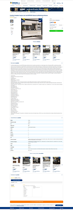
Competitor screenshots
Click on the image to view it in full size.
Esplanada Móveis

Madesa

Cybelar

Casas Bahia

Eletrolar

Colombo
UX Analysis
The key aspects that could impact the usability of the product page were evaluated and are outlined below.
-
The breadcrumb is not clickable at all levels displayed—only at some of them.
-
The shipping component has a button that is too large and shares the same color as the CTA above, resulting in poor color hierarchy.
.png)
-
When there is more than one SKU selector, the label for the other color option is missing. The user only sees this detail if they navigate to the other PDP for that variant.
.png)
-
The pop-up opened by the "Payment option" button has a background similar to the one behind it, which could cause confusion for the user.
.png)
-
There is no option to share the product (via WhatsApp, email, or social media).
-
The "Included Modules" component is in a carousel format, which may confuse the user as they cannot immediately determine how many items are included. Additionally, it lacks bullets or numbering to help with organization.

-
Several components on the page have low contrast ratings, which include the breadcrumb, the "Original Price," pink and white buttons and tags, the "Installment Options" button, shipping expansion texts, the text "Check out the video below" in the video component, all text in the "Description" component, and the buttons "Most Recent" and "All" in the reviews section.
Suggestions for improvement
Buybox
Display the variation labels for SKUs
When there are variations in the PDP, display the label for these variations — such as the color name, model name, or size — alongside the image, ensuring users can quickly identify their selection.
Modify the shipping component button
Use a more neutral color for the button and reduce its size.
Neutralize general page elements
The general page elements (such as stroke of the thumb, arrows, heart, tags, etc.) should have more neutral colors. The brand colors (pink and blue) should be reserved for elements that need emphasis, such as CTAs (Call to Action) buttons.
Enhance the "Payment options" pop-up
Add a distinct background to the pop-up to differentiate it from the rest of the page.
Clarify payment method for discounts
Clearly specify the payment method required to obtain a particular discount displayed, ensuring users understand whether the offer applies to credit cards, debit cards, bank transfers, or digital wallets, minimizing confusion during checkout.
Add a product sharing component
Allow users to share the product on social media, via WhatsApp, or email.
Product Information
Improve the display of "Size," "Technical Specifications," and "Assembly and Manual" buttons
Ensure that users don’t mistakenly perceive these components as having horizontal scrolls.
Relocate the video component
Move the video component below the "Description" and above the "Reviews."
Improve the "Modules" component
Clearly show the number of modules included, making this info accessible without navigating to each module's PDP.
Additional Points
Verify the breadcrumb functionality
Ensure the breadcrumb is clickable at all levels.
Show kitchen showcases with varying module quantities
For example, show kitchen setups with 3, 4, or 6 modules.
Check the zoom feature on mobile
Ensure the zoom functionality works smoothly on mobile devices.
Usability Improvements: Before and After
In this section, we present the updated wireframes, highlighting the improvements made to the page's usability. The comparison between the original design and the revised version illustrates the changes made to optimize navigation, information clarity, and the overall user experience.
Before - Desktop
Wireframe with suggestions - Desktop
Before - Mobile
Wireframe - Mobile

.png)


Data Analysis: Assessing improvements in critical areas post - new layout
This analysis aims to assess whether the changes implemented in the new layout resulted in improvements in the critical points identified in the previous analysis. Around 80 session recordings from the new product page were analyzed using Microsoft Clarity, focusing on clicks, mouse movements, quick returns, and rage clicks. Key patterns observed:
Increase in functional clicks
Inactive clicks on the product price have been reduced, while functional clicks on the favorites icon and shipping component have significantly increased. The product title still generates some inactive clicks, as users often copy and paste data to compare prices elsewhere.
Clicks on product description tabs
There has been a considerable increase in user interaction with the product description tabs. This behavior indicates greater engagement and interest in detailed information, suggesting that users are seeking more context and data before making purchase decisions.
Module area
In the module area, there has been a reduction in inactive clicks and a substantial increase in active clicks, especially on the "Add to Cart" CTA (call to action). This shift reflects an improvement in the usability and relevance of the presented options, encouraging users to take more effective actions during the navigation process.
Scroll interaction
Many users scrolled to the bottom of the page, engaging with sections and components that were previously overlooked. This indicates increased user interest and improved layout relevance, encouraging deeper exploration of the content.
Heatmap analysis - new layout
The website logo has been hidden for the presentation of this project.
This decision was made to maintain focus on the proposed solutions, highlighting the analyses and improvements made.
Mobile
Desktop


-
In the first fold, the favorites icon, the reviews button, and the delivery component received significant user interaction.
-
The newly added sharing component in this layout also attracted considerable engagement, along with the informational elements displaying product measurements.
-
The tabs anchoring users to specific product descriptions saw high interaction rates as well.
-
Additionally, the new component illustrating the furniture modules gained strong engagement, especially with the "Add to Cart" button.
-
Just like on mobile, users displayed similar interactions with the page components.
-
Specifically on this device, there was even greater engagement throughout the entire page.
-
Unlike mobile behavior, there was a noticeable increase in interactions starting from the second fold of the page.
-
Users showed more immersive navigation, actively exploring various elements in the lower sections of the page.
Quick data: Comparison of user interactions - Before and after the new layout
To assess the impact of the new layout, we analyzed user interactions over a 3-day period, focusing on key components. The data reveals a clear improvement in engagement and usability:

Conclusion
The analysis revealed significant progress following the implementation of the new layout, reflecting a positive impact on the user experience. We observed:
-
Reduction of inactive clicks: Components that previously generated unproductive interactions, such as the product price, now guide users toward relevant actions, improving navigation efficiency.
-
Increased engagement: There was a consistent rise in interactions with strategic icons, such as favorites, reviews, and shipping, indicating greater interest in the available features.
-
Deeper exploration: Navigation was not limited to the first fold — on both mobile and desktop devices, users showed curiosity in exploring lower sections, including product modules and detailed information.
-
Intuitive conversion: The new module component gained strong user interaction, especially with the "Add to Cart" button, reinforcing the clarity of calls to action (CTA).
These results demonstrate that the applied changes not only addressed the critical points identified earlier but also encouraged a smoother, more interactive, and intuitive shopping journey.
The next step is to continue monitoring this data to ensure consistent performance while identifying new opportunities for optimization based on user behavior.
Take aways
This project was a great opportunity not only to apply data-driven UX methods but also to reinforce the importance of user-centered decisions.
It became clear that, beyond identifying critical points, it is essential to track improvements and test continuously, ensuring that the proposed solutions genuinely enhance the user experience.
On the other hand, there is also a human side to this process: understanding that behind every data point, there is a person trying to find a product, ask a question, or complete a purchase. And that’s what makes the UX field so incredible — we are always balancing numbers, logic, and empathy. :)