Redefining the online shopping experience: UX analysis for a makeup e-commerce
8 mins read
Timeline: 2 weeks
Role: End to end UX process
Problem
Many users struggle to buy makeup products online due to confusing navigation, unclear information, or checkout friction.

Goal
Improve the shopping experience by making navigation more intuitive and increasing user satisfaction.
Solution
I ran a usability test and conducted a heuristic analysis to pinpoint issues and propose improvements. After redesigning key interface elements in Figma, I performed a second usability test to assess the impact of the changes.
Key results
- 60%
- 38%
+ 16%
+ 75%
in checkout time
in add-to-cart time
in task completion
positive interactions with the buy box
Reduced the average time from 3m 10s to 1m 52s.
Cut the time from 45s to 28s.
Task success increased from 75% to 91%.
Favorable interactions improved from 17% to 92%.
Heuristic analysis
I conducted a heuristic analysis of the purchase flow, identifying usability issues and opportunities to improve the user experience.
The original images were adapted to preserve the models' privacy, keeping the focus on the proposed design and usability solutions.
A false floor occurs when a page appears to end at the first fold, but there is more content below, potentially stopping users from scrolling.
False floor

In this example, the Océane website avoids this by displaying partial images at the fold, signaling continuity.
Correct design example

The search bar is closed by default, but for this type of e-commerce, keeping it open helps product discovery. In addition, when opened, it covers the top menu and icons, making navigation harder and adding unnecessary friction.
Search bar closed

In the "Quem Disse, Berenice" example, the search bar is open by default, ensuring that users can quickly start a search without extra clicks. Additionally, all header icons remain visible, allowing seamless access to key features and improving navigation.
Correct design example

The minicart has a layout issue between the title and item count, and inconsistent naming—while the title and icon refer to a "bag," the text mentions "cart" twice, which may confuse users. Additionally, there's no CTA encouraging users to browse and shop.
Inconsistencies in the minicart

In the example below from the "Oceane" website, we can see consistency between iconography and text, standardizing the term "bag." Additionally, the design is visually harmonious, and there is a CTA motivating users to add items to the minicart.
Correct design example

The "try me" button and quick view icon are not commonly found among direct competitors, making them unfamiliar to users and potentially causing navigation difficulties. Additionally, the "try me" button partially overlaps the favorites icon, obstructing its visibility.
Unfamiliar components of the product card

This example showcases user-friendly elements like tags, rating icons, a favorite option, and a brief product description. These familiar features create an intuitive interface, allowing users to find information and make decisions more efficiently, enhancing their navigation experience.
Correct design example

The newsletter input fields have low contrast, making them harder to read, especially for users with visual impairments - this can make it more challenging for individuals to engage with the content. Also, the lack of the opt-in checkbox required by the General Data Protection Law raises compliance concerns, potentially leading to legal issues.
Accessibility in the newsletter

On the Mari Maria Makeup website, we can observe that the newsletter features an adequate contrast, ensuring better readability. Additionally, it includes the opt-in checkbox required by the General Data Protection Law (LGPD), aligning with legal requirements and providing users with a clear consent option.
Correct design example

The footer presents information in a disorganized manner, with sections such as social media and payment methods lacking clear headings or labels. This lack of structure makes it difficult for users to quickly locate important details, especially those who navigate to the footer specifically looking for assistance or relevant links.
Footer with scattered information

In the example below, we can observe a footer that is well-organized hierarchically, with clear and appropriate headings, sufficient spacing, and a distinct separation of components. The structured layout not only aids in quick information retrieval but also ensures that users can easily identify and access important sections, improving overall usability.
Correct design example

The department page features icons that are difficult for users to understand, particularly regarding the number of products displayed and their layout. Additionally, it does not provide information on the total number of products available for viewing.
Icons on the department page

In this example, as well as in all the direct competitors analyzed, there are no icons related to the product display mode. Instead, they provide information on how many products are on the page and offer sorting options based on user preferences, thereby improving usability.
Correct design example

There is an overload of information in the buy box area, distracting the user from the main focus. The shipping component has low contrast, and there is neither a title or assistance if the user forgets the postal code (CEP). Additionally, there is a lack of titles for the social media and payment method icons.
Overload of information in the product page

In the example below, the most important product page information is correctly distributed hierarchically, with clear titles, supporting text, and user assistance. This structured approach ensures that users can easily find what they need without feeling overwhelmed by excessive information, allowing for a smooth and intuitive navigation experience.
Correct design example

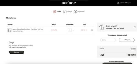
When the user navigates to the cart, there is no page title, and the only visible elements are the gift wrapping option (unavailable, occupying nearly the entire screen) and the buy box, which fails to provide detailed information about the product(s).
Cart with inadequate usability

In the example below, we see an ideal cart page, featuring a clear progress bar, informative titles, detailed product specifications, a delivery component, the buy box, a section for discount coupons, and also an option for gift wrapping.
Correct design example
There is no clear identification of the required fields in the checkout form. Users only receive feedback after attempting to proceed to the next step without completing the necessary fields, which can cause confusion and disrupt the user experience, as proactive guidance would be more efficient.
Lack of identification of required fields in checkout

In the example below, the required fields are clearly marked with an asterisk, a familiar element to users, allowing them to easily identify which fields need to be filled out. This proactive approach helps users avoid any surprises when attempting to proceed to the next step, enhancing the overall experience.
Correct design example

Usability test - Identifying problems
Before making any changes, I conducted a usability test with 12 participants to observe how they navigated, from the initial navigation to the payment step. The focus is to identify pain points, areas of confusion, and potential improvements to enhance the user experience.
Target Audience: Users who shop online, with varying levels of experience in digital purchases.
Below, you can click to open the instructions and questions used during the user test, as well as the follow-up questions asked after the test.
.png)

Key findings
Navigation and search
16%
didn't realize there was more content below the fold due to the false floor effect, missing key product categories and promotions.
25%
Struggled to find the search bar on the homepage. When expanded, 2 participants found it confusing that it covered the header icons.
User quotes:
"I kept looking for the search bar, but it took me a while to realize I had to click something first."
"Why did the cart icon disappear when I opened the search?"
Products cards and information
58%
found the icons on the product cards ('Teste-me' and 'Quickview') confusing, with no explanation of what they are.
16%
missed the quantity selector. They usually buy more than one item and don't know where to select the quantity.
User quotes:
"I've never seen the eye icon in the middle of the product photo and I don't know what it means."
"Whenever I buy makeup for myself, I also buy for my daughters. Where do I select more?"
Buy box experience
83%
found the buy box area overwhelming, with too much information crammed together. Users struggled to focus on the main action — adding a product to the cart.
41%
They mentioned that they couldn’t easily see where to calculate the shipping cost, as the component was almost imperceptible. Some also forgot their postal code and felt there was no assistance available.
User quotes:
"It seems like the texts next to the photo are messy, and I don’t know where to direct my attention."
"Where can I calculate the shipping cost? Depending on the value, I might not make the purchase."
Checkout process
91%
were very confused on the cart page. The prominent gift wrap option (which was unavailable) took up most of the screen, distracting from the actual cart contents. Most thought it was a bug.
58%
were uncertain about the mandatory fields in the checkout form. Many reported feeling reluctant to fill everything out.
User quotes:
"Ops, what happened here? The first thing I noticed in the cart was the gift wrapping — not the product I added."
"When I see so many fields to fill out, I feel so lazy! Which ones can I skip to finish quickly?"
Quantitative results
75%
completed all tasks successfully, though some required extra time (due to confusion at checkout).
45 seconds
was the average time to add a product to the cart.
3 min
10 sec
was the average time to complete checkout (with errors and corrections).
Layout adjustments
Based on the heuristic analysis and usability test insights, I identified key pain points — from confusing icons to unclear checkout flows — and implemented targeted improvements in the Figma layout.
Header - Before
Header - After
Improved accessibility in the top menu
Search bar in primary open state
Icons always visible
Product cards - Before
Product cards - After

Improvement of product cards: adding tags, visible favorite icon, description, reviews, detailed price, quantity selector, and carousel with bullets and side arrows.
Newsletter & footer - Before
Newsletter & footer - After

Reformulation of the newsletter and footer: improved accessibility, titles, and harmony of the displayed information.
Empty minicart - Before
Empty minicart - Before
Empty minicart - After
Minicart with products - Before
Minicart with products - After

Improvement of the empty cart communication and addition of main categories to explore.
Better display of the shipping component and price details.
Category page - Before
Category page - After

Addition of the open sidebar filter, improvement of sorting, and product display
Product page - Before
Product page - After

Better harmony and organization of the buybox information and product description, making the navigation smoother.
Cart - Before
Cart - After

Insertion of the progress bar, page title, improvement of components related to product information, shipping, and purchase summary.
Checkout - Before
Checkout - After
.png)
Segmentation of checkout steps, making it easier for the user to understand and identifying mandatory fields.
Usability test - Assessing the impact of layout improvements in Figma
After the improvements were implemented in the Figma layout, I conducted the usability test again with 9 new participants, using the same script from the first test and the Figma prototype.
The goal was to assess if there were any significant changes in the user experience after the improvements.
Key findings
Navigation and search
All users
performed the scroll down, meaning the 'false floor' effect was not observed.
8%
encountered a slight issue when interacting with the search bar, as they searched for the voice feature and couldn't find it.
User quotes:
"For me, the website has a lot of content, and I feel there are many things to explore."
"I don't have any disabilities, but I like to use the voice feature in the search bar."
Products cards and information
16%
encountered some obstacles when interacting with the product card, such as finding the descriptive texts too long.
All users
noticed the quantity selector and had ease of interaction.
User quotes:
"I liked the little text that explains the product; it makes understanding the product easier, but it can be shorter."
"I hope there is a discount if I buy more than one unit of the lipstick."
Buy box experience
8%
faced difficulties when interacting with the buy box, as they were confused about the availability of color variations for the product.
All users
were able to easily view the shipping component and interact with the 'I don't know my ZIP code' button.
User quotes:
"How can I check if there are other colors of this product?"
"The shipping component is very clear to me, and I like that it has assistance because I can never remember my zip code."
Checkout process
All users
had positive interactions on the cart page with the components and did not have any doubts.
25%
did not find the checkout very favorable, mentioning that the form was lengthy, but they had no issues identifying the required fields.
User quotes:
"It's very easy to check the products I added to the cart, and the information is easy to understand."
"I’m lazy to fill out the checkout, but I liked it because it feels like a video game to fill out, very well divided."
Quantitative results
91%
completed all tasks successfully, though some required extra time (due to confusion at checkout).
28 seconds
was the average time to add a product to the cart.
1 min
52 sec
was the average time to complete checkout (with errors and corrections).
Conclusion
After conducting the heuristic analysis and usability tests, several critical points that negatively impacted the user experience, particularly in the purchasing process, were identified. Based on this information, I implemented improvements to the Figma layout, focusing on optimizing navigation, information clarity, and the fluency of the checkout process. The adjustments aimed to create a more intuitive shopping journey, free from friction, and ensure users could quickly find what they needed with minimal effort.
The results after the improvements show a significant positive impact, with participants encountering fewer obstacles and interacting with the site’s components in a smoother, more intuitive way. The reduction in average time to add a product to the cart and complete the checkout process highlights the improvement in the purchasing flow, making it more efficient and satisfying.
Quick data - Comparison of improvements percentages
The table below presents a clear and objective analysis of user interactions before and after the implementation of the new layout.

Take aways
This project was incredibly insightful, as it demonstrated how small design changes can significantly improve the user experience. Through heuristic analysis and usability testing, I identified user pain points and addressed them effectively. Conducting a second test with the updated prototype further highlighted how design can evolve to meet user needs.
A key takeaway is that there is always room for improvement. Even after the second test, new friction points (like the absence of voice search) emerged, underscoring the importance of continuous product improvement. Iterating on designs is essential for enhancing the user experience.
Overall, the improvements reduced friction, making the process smoother and more enjoyable for users. This project reinforced the value of testing design decisions and showed how layout adjustments can optimize the shopping experience and increase user satisfaction.